Excerpt, pages 3 to 6 of 13. Fictional brand, written to show the format.
Page reviewed: the free trial landing page, on desktop (1440 px wide) and mobile (390 px wide). Primary conversion: trial form submitted. Main visitor: owner or general manager of an independent restaurant with 5 to 50 staff.
Findings
| Finding | Why it matters | Fix | Impact | Effort |
|---|---|---|---|---|
| Headline says "workforce optimization" | Owners think in schedules and shifts, not this term | Use their words: schedule, shifts, staff | High | Low |
| On mobile the button sits below a tall hero image | Visitors must scroll before they see a way to start | Shrink the image and keep the button on the first screen | High | Low |
| Trial form has 9 fields, including role and revenue | Each field is a reason to stop; the trial needs 3 | Ask for name, email and restaurant name only | High | Medium |
| No price anywhere on the page | Owners of small restaurants expect a price and leave to find one | Add "From $29 per location per month" under the button | High | Low |
| Two hero buttons with equal weight | "Book a demo" and "Start trial" compete | Keep trial as the button, demo as a text link | Medium | Low |
| No product screenshot, only stock kitchen photos | Visitors cannot see the tool they would use every week | Show a phone screen with a real weekly schedule | Medium | Medium |
| Card requirement is not stated | Visitors assume a card is needed and hold back | Add "No credit card needed" under the button | Medium | Low |
| Hero video adds 8 MB before text loads on mobile | Slow first view on cellular connections | Replace with a compressed still image | Medium | Low |
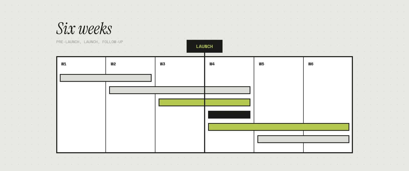
Order of work: the six low-effort fixes first, as one release. They need copy and layout changes only, no development sprint. The form change and the screenshot follow in the second release, once the onboarding team confirms which fields can move to the first login.
Hero copy: before and after
Before (desktop and mobile)
Headline: Workforce optimization for modern hospitality
Subheadline: Rostera's intelligent platform empowers operators to streamline labor management and drive efficiency across every location.
Button: Get started
What is wrong with it
- The headline names a category, not an outcome. An owner reading it still does not know the product makes schedules.
- "Empowers," "streamline" and "drive efficiency" could describe any software. None of them says what changes on a Tuesday night.
- "Get started" does not say what happens next or what it costs.
After
Headline: Build next week's staff schedule in 15 minutes
Subheadline: Drag shifts into place, let staff swap shifts from their phones, and see labor cost against forecast sales before you publish. Made for restaurants with 5 to 50 staff.
Button: Start my free 14-day trial
Line under the button: No credit card needed. From $29 per location per month after the trial.
Notes on the rewrite
- Use "15 minutes" only if onboarding data supports it. If it does not, use "Build next week's staff schedule in one sitting" instead.
- The subheadline lists three tasks the owner does every week, in the order they do them.
- The button copy repeats the offer, so the line underneath can answer the price question instead.
A/B test ideas
- Headline angle. Time promise ("in 15 minutes") against pain removal ("Stop building schedules in spreadsheets"). Metric: trial starts per visitor.
- Form length. 3 fields on one screen against email only, with name and restaurant asked on the next screen. Metric: completed trials, not form starts.
- Price placement. Price under the button against a short pricing strip lower on the page. Metric: trial starts and the share of trials that pick a paid plan.
Run one test at a time. Plan for each version to reach at least 300 trial form views before calling a result.